
A brand that celebrates food for everything it is, and provides a pantry-full range of products which are not just good, but good for you, across 15+ categories and 200+ SKUs.
REBRANDING + MARKETING STRATEGY + PACKAGING + UI/UX
Zama is a brand that brings the best of India’s ingredients
to India and the world, rooted in deep sourcing, cultural memory and trust. They work directly with over 50,000+ farmers and producers across the country to source ingredients that are pure, seasonal and regenerative—
from single-origin spices and cold-pressed oils to heirloom grains, natural sweeteners, salts, and regional icons like Kashmiri Mongra Saffron.
Over the course of a year, we worked together with the founder, Shriya, to create a new brand identity for Zama. We built the core foundation of the brand, right from its brand ethos, expansion strategy, and social media approach to creating a visual identity that expanded onto its packaging, merchandise, website and even the amazon home-front. Together, we built a unique brand that speaks true to what it stands for through every touchpoint.

EXISTING VISUAL LANGUAGE
Until now, Zama had been primarily known as a grocery brand with fruits and vegetables at its core. As the business expanded, the focus shifted towards growing the non-perishable category and building a portfolio of healthier, everyday kitchen essentials. This evolution required a broader brand identity, moving beyond a black-and-white organic positioning to encompass a wider spectrum of conscious choices, including natural, preservative-free, additive-free, gluten-free, and vegan products across multiple categories.

Consumer Mindset
Challenge
With so many brands claiming to be organic, how does one trust a brand's quality and the products' honesty to its origin?
Organic products are usually branded a particular way and hence associated to be healthy, not tasty. How can a brand be both?
I don't want to be forced onto wellness, but I want to be able to judge and choose a life where I consume products that are good for me.
How far do we depart from the brand
Awareness about such kind of products, and how do we need to communicate it through the brand
What you consume has only become associated to what you feel after. How do we make sure this food makes you feel happy about choosing it?
Opportunity
Health is an investment and it all begins at a very basic level – your kitchen. Zama aims to transform that right from staples, fresh produce to condiments and snacks.
Goal
To become synonymous as your everyday grocery brand.

Bringing the joy in eating healthy!
Convenience, Choice & Comfort- the dynamic power of 3Cs became the core of the brand.
This right here became the key brand statement, to reinforce all things important across the brand.


So here are the core elements that we introduced for the brand:
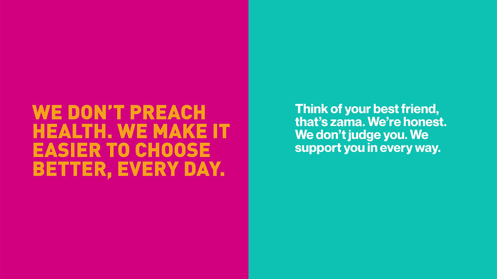
🎤 The brand's tone of voice, framed with the words 'THIS IS...', embodies their mission to connect with everyone. It keeps the voice honest, humble and straight to the point.
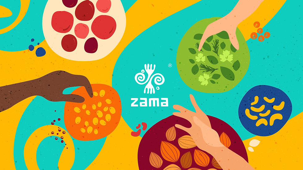
👐 The incorporation of hands - this single element signifies so much. It embodies tradition, the passing down of recipes and heritage. It carries the essence of care and love in every thoughtful meal. Within the brand, it encapsulates the heart and soul poured into every Zama product, celebrating the hands that nurture, cultivate and share in the joy of good food.
💌 The zigzag note element - it is a personal letter to their customers, etched into every product and communication.
🎨 The introduction of many vibrant colours -
It signifies celebration, joy and happiness; emotions we all associate with food.
🍎 Custom organic illustrations and squiggles, tailored for each product and occasion. They echo their mindful approach while infusing playfulness.
Brand Positioning
Brand Personality
‘THIS IS’ became the foundation of Zama’s communication system - a simple way to express what the brand stands for.
Used across everything from product descriptions to pitch decks, it brought clarity, consistency and trust to
every message.
What works
What doesn't
To be focussed on the benefits
To be humble and honest about the offering.
To be more personal in the way we communicate.
This is a gluten-free plant protein.
We are here to create products that are good for you.
These products are made with the finest quality of ingredients that are sourced from the heart of the farms
of India.
This is organic brown rice.
We create the best products that you need.
The products are organic products with pure ingredients that come from nature.

Custom-made illustrations to help keep the brand raw and organic, while being playful!
We also retained the brand logo as is, but didn't let its twirls and twists go waste. Those curved lines became a fun way to add more depth to how the brand communicates.
To support Zama’s expanding product universe, we designed a flexible illustration system that was both minimal and expressive. The illustrations highlighted ingredients in their most authentic form, while a playful visual language added character and made the brand feel approachable across every touchpoint.


Stress testing layouts helped build a packaging system designed to scale.
-
Tests scalability across SKUs, pack sizes, and future extensions.
-
Validates information hierarchy under varying content requirements.
-
Strengthens shelf impact by balancing consistency and differentiation.
-
Reveals edge cases early, preventing system breakdowns.
-
Builds flexibility for new products and categories.
-
Reduces future rework by identifying issues before rollout.


We wanted the brand to be perceived as the ones who just get it. You know the ones, who know what you like, what you need and gets it right. And that's how Zama's brand values (the dynamic 3Cs - Choice, Comfort and Convenience) became the key drivers for all brand decisions.
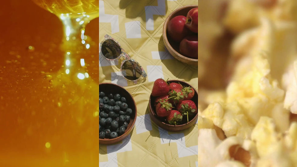
Across all digital platforms, our goal was to ensure we brought the story of Zama to life. Keep it real, keep it authentic, keep it simple.
That's how the brand would always feel approachable and warm.


The imagery style was intended to strike an emotion in you- like the sound of popcorn popping, the thought of eating together from the table, the juices of a mango flowing, all to accentuate the richness of Zama's assortment.


By defining what Zama stands for and how
it shows up in the world, we created a brand that could grow without losing itself.
One that has gone on to become a category leader, recognized for its quality, trusted by its consumers and built to scale for years to come.
THIS IS how Zama didn't just sell ingredients, they built belief.
Client: Zama Organics
Studio: Beyondesign
Creative Director: Bhavika Shah